
You can do everything “right” to get traffic—publish blog posts, improve SEO, run ads, post on social—and still wonder why sales or leads don’t follow.
That’s usually not a traffic problem. It’s a conversion problem.
Conversion Rate Optimization (CRO) is the practice of improving your website experience so more of the people already visiting take a meaningful action: buy, request a quote, book a demo, sign up for a newsletter, or start a free trial.
This guide walks you through practical conversion optimization hacks you can apply to most websites (eCommerce, local services, SaaS, agencies—anything). No fluff. Just the kind of improvements that remove confusion, reduce friction, and increase trust.
What conversion rate optimization really means
At its simplest, your conversion rate is:
Conversions ÷ Total visitors × 100
But CRO isn’t only about “more sales.” It’s about improving the full journey:
- Micro-conversions: clicking a CTA, watching a demo video, adding to cart, starting checkout
- Primary conversions: purchases, completed lead forms, booked calls, paid subscriptions
- Quality signals: lower bounce rate, longer time on page, higher return visits
When you optimize for the right conversions, you don’t just squeeze more out of the same traffic—you build a website that feels easier, faster, and more credible.
A simple CRO framework: clarity, friction, and trust
If you want a quick way to diagnose why a page isn’t converting, use this three-part lens:
- Clarity: Do visitors instantly understand what you offer and who it’s for?
- Friction: How much effort does it take to move forward (scroll, read, click, fill forms, pay)?
- Trust: Does the page feel legitimate, safe, and proven?
Most conversion wins come from fixing one of these.
Essential conversion optimization hacks to increase customers
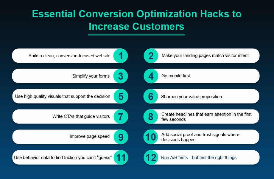
1) Build a clean, conversion-focused website
A beautiful website can still convert poorly if it’s cluttered. A conversion-focused layout prioritizes one thing: helping the visitor make a decision quickly.
What to do:
- Keep navigation simple (fewer choices = faster decisions)
- Use clear visual hierarchy (headline → key benefit → proof → CTA)
- Add breathing room (white space makes content feel easier to read)
- Avoid competing CTAs on the same screen
Quick win: remove any element that doesn’t support the main goal of the page (extra menus, unrelated banners, distracting pop-ups). If it doesn’t help the visitor decide, it’s noise.
2) Make your landing pages match visitor intent
One of the biggest CRO mistakes is sending paid or SEO traffic to a generic page.
If someone searches “accounting software for freelancers,” they want freelancer-specific messaging. If your landing page says “All-in-one business platform,” you’ve already lost them.
What to do:
- Mirror the promise from the ad/search snippet in your headline (message match)
- Lead with outcomes, not features (“Save 5 hours a week” beats “Automated reports”)
- Use a single, obvious next step (buy, book, download, start trial)
Mini takeaway: the best landing pages feel like the visitor landed on the exact page they were hoping to find.
3) Simplify your forms (and ask only what you truly need)
Long forms quietly kill leads. Every extra field is a small “tax” on the visitor.
What to do:
- Start with the essentials: name + email (and phone only if you’ll actually use it)
- Use optional fields for “nice-to-have” info
- Add inline validation and clear error messages
- Consider a two-step form (Step 1 is easy; Step 2 gathers details)
Example: instead of a 10-field quote form, try:
- “Get a fast estimate” (name + email)
- “A few quick details” (budget range, timeline, preference)
You’ll often get more submissions—and you can still qualify leads later.
4) Go mobile-first (because that’s where most first visits happen)
Even if you sell to people on desktops, many first-time visitors discover you on mobile. If your site is hard to use with a thumb, conversions drop.
Mobile CRO essentials:
- Buttons that are easy to tap (no tiny links)
- Forms that are short and autofill-friendly
- Text that’s readable without pinching to zoom
- Sticky CTA for high-intent pages (e.g., “Call now” or “Book a demo”)
Quick test: open your key page on your phone. Can you understand the offer in 5 seconds and take action in 15?
5) Use high-quality visuals that support the decision
Visuals aren’t decoration—they’re persuasion. Great images and videos reduce uncertainty and help people imagine the outcome.
What works well:
- Product photos from multiple angles (or screenshots for software)
- Short explainer videos (30–90 seconds)
- “Before and after” examples (when applicable)
- Simple diagrams that explain your process
CRO tip: keep visuals fast-loading. Compress images, limit heavy video embeds, and avoid bloated sliders. A slow page can erase the benefit of great creative.
6) Sharpen your value proposition (and make it impossible to miss)
Your value proposition is the clearest answer to:
“Why should I choose you instead of doing nothing or choosing a competitor?”
A strong value proposition includes three parts:
- Who it’s for
- What you help them achieve
- Why you’re different
Example formula:
Helping [audience] achieve [desired result] in [time/effort] without [common pain].
Place your value proposition above the fold, then reinforce it with benefits, proof, and a strong CTA.
Important: keep each page focused on one primary offer. If you sell multiple services, create separate landing pages so the message stays sharp.
7) Write CTAs that guide visitors (not just shout “Buy Now”)
A CTA works best when it reduces decision anxiety. The goal is to make the next step feel safe, specific, and worthwhile.
CTA upgrades that improve click-through rates:
- Use action + outcome language (“Get my free audit,” “See pricing,” “Start saving time”)
- Add microcopy under the button (“Takes 30 seconds,” “No credit card required”)
- Repeat the CTA at natural decision points (top, mid, bottom)
- Use contrast and spacing so the button is easy to spot
Pro move: match CTA strength to intent.
- Low intent: “Download the checklist,” “Watch the demo”
- High intent: “Start trial,” “Book a call,” “Checkout securely”
8) Create headlines that earn attention in the first few seconds
Your headline has one job: convince the visitor to keep reading.
Great headlines usually do at least one of these:
- Promise a clear outcome
- Call out a specific audience
- Address a pain point
- Create curiosity without being clickbait
Try this structure:
- “Get [result] without [pain]”
- “The simplest way for [audience] to [result]”
- “Stop [problem]. Start [better outcome].”
Using “you” and “your” makes headlines feel personal and direct. And don’t forget subheadlines—they can turn a good headline into a great one by adding context.
9) Improve page speed (because slow pages leak conversions)
A slow-loading page is like a long checkout line. People leave.
High-impact speed fixes:
- Compress images and use modern formats when possible
- Remove unused plugins, scripts, and third-party widgets
- Use caching and a performance-focused theme/framework
- Keep your page layout lightweight (avoid heavy sliders and animations)
Practical tip: prioritize speed on your highest-value pages first—homepage, top landing pages, pricing pages, and checkout.
10) Add social proof and trust signals where decisions happen
Most visitors arrive with skepticism. Social proof helps them borrow confidence from other people’s experiences.
Effective types of social proof:
- Testimonials with specifics (results, timeframes, context)
- Case studies with measurable outcomes
- Reviews and star ratings
- Logos of recognizable clients (if permitted)
- “As seen in” mentions (only if real)
Where to place it:
- Near primary CTAs
- On pricing pages
- On checkout pages (especially around payment fields)
- On the “Thank you” page (to reinforce trust and reduce refunds)
Quick win: ask for testimonials automatically. A simple email sequence sent 2–4 weeks after purchase can collect fresh reviews without manual chasing.
11) Use behavior data to find friction you can’t “guess”
CRO improves faster when you stop relying on assumptions.
Start with these data sources:
- Analytics (drop-off points, bounce rate, device breakdown)
- Heatmaps (where people click, scroll, and hesitate)
- Session recordings (where users get stuck)
- On-page surveys (“What stopped you from signing up today?”)
Mini takeaway: the most profitable CRO changes usually come from fixing one obvious point of confusion.
12) Run A/B tests—but test the right things
A/B testing is powerful when it’s used strategically, not randomly.
What to test first (highest impact):
- Headline + subheadline (clarity and relevance)
- Primary CTA copy (action and outcome)
- Page layout (proof placement, content order)
- Offer framing (bonus, guarantee, trial length)
- Form length (fewer fields vs. more qualification)
A simple testing rule: change one major variable at a time, and define success before you begin (e.g., “increase demo requests by 15%”).
If traffic is low, focus on bigger changes and qualitative feedback instead of tiny button-color experiments.
Bonus CRO tactics that often outperform “design tweaks”
If you want extra leverage, these are worth trying:
- Risk reversal: add a guarantee, free returns, or “cancel anytime” language
- Pricing transparency: reduce sticker shock with clear plans and what’s included
- Objection handling: add an FAQ section that answers the real concerns (time, cost, credibility, results)
- Checkout cleanup (for eCommerce): allow guest checkout, show shipping early, keep steps visible
- Follow-up for non-converters: capture emails with a useful lead magnet and nurture with value
These don’t just make a page prettier—they make the decision easier.
A quick CRO checklist you can use today
Use this as a fast scan of your key pages:
- Is the main offer clear within 5 seconds?
- Is there one obvious primary CTA?
- Does the page answer “Why you?” with proof?
- Are forms short and easy to complete?
- Does the page look great on mobile?
- Do pages load fast on mobile data?
- Is social proof placed near the point of decision?
- Are FAQs addressing real objections?
- Are you reviewing behavior data monthly?
- Are you running at least one meaningful test each quarter?
CRO FAQs (quick answers to common questions)
What’s a “good” conversion rate?
It depends on your industry, traffic quality, and offer. Instead of chasing a universal benchmark, track your own baseline and aim for steady, test-driven gains (even a 10–20% lift can be huge over a year).
Should I redesign my whole website to improve conversions?
Usually, no. Start with your highest-traffic, highest-intent pages and make targeted changes first (headline clarity, CTA placement, form length, speed). Big redesigns are harder to measure and often introduce new problems.
How long should an A/B test run?
Run tests long enough to capture normal behavior across weekdays/weekends and to collect a meaningful sample size. As a rule of thumb: avoid stopping the moment you see a spike—wait until results are stable.
What if I don’t have enough traffic to test?
Focus on “sure wins” (clarity, speed, mobile usability, trust signals) and use qualitative data: session recordings, on-page surveys, and customer interviews. You can still improve conversions without high-volume experiments.
Wrapping up
Turning visitors into customers isn’t about gimmicks. It’s about removing confusion, reducing effort, and building trust—one improvement at a time.
Start with your highest-impact pages (top landing pages, pricing pages, checkout, lead forms). Apply two or three of the hacks above, measure the results, and keep iterating.
Over time, CRO compounds. Your traffic becomes more valuable, your marketing ROI improves, and your website starts doing what it was built to do: convert.
